Achieve Beautiful Text with CSS text-wrap: balance
CSS text-wrap: balance: Achieve Perfect Text Headlines and Layouts
Have you ever struggled with uneven line breaks in your headings or short text blocks, especially on responsive websites? CSS text-wrap: balance is a new and incredibly helpful property designed to solve this problem, creating more visually appealing and balanced text layouts.
The Problem: Uneven Line Breaks
By default, CSS text wrapping prioritizes fitting text within its container. This can often lead to headings and short paragraphs breaking in awkward places, creating visually unbalanced lines, especially when text length is close to the container width or on varying screen sizes.
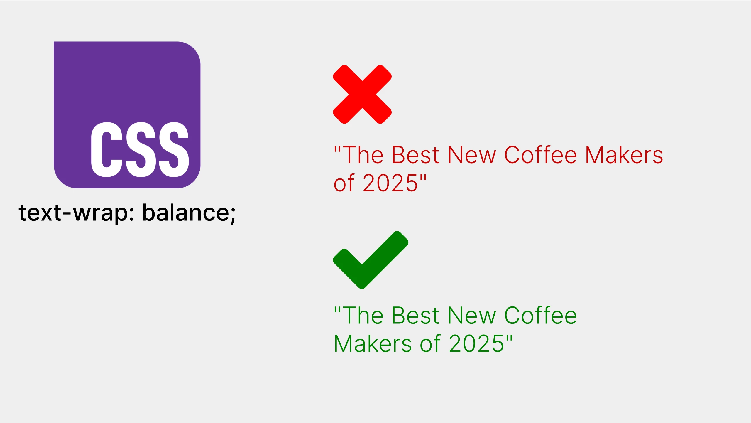
Example of Unbalanced Text:
Imagine a heading like:
"The Best New Coffee Makers
of 2025"
Depending on the container width, it might break like this, which can look visually unappealing:
"The Best New Coffee Makers of
2025"
The Solution: text-wrap: balance;
text-wrap: balance; is a CSS property value that tells the browser to try and create more visually balanced line breaks in text. Instead of just wrapping at the first opportunity, it considers the overall shape and length of the lines to produce a more harmonious and even appearance.
How text-wrap: balance Works:
When you apply text-wrap: balance; to an element, the browser will:
- Analyze potential line break points: It looks at where the text could wrap.
- Evaluate line length balance: It calculates the visual “balance” of different wrapping possibilities, aiming for lines that are roughly similar in length.
- Choose the most balanced break: It selects the line break that results in the most visually pleasing and balanced text block.
Code Example:
CSS

h2 {
  `text-wrap: balance;`
  max-width: 600px; /* Important to see the effect on wrapping */
}
HTML
<h2>The Best New Coffee Makers of 2025</h2>With text-wrap: balance;, the browser will strive to break the heading in a way that creates more even line lengths, potentially resulting in something like:
"The Best New Coffee
Makers of 2025"
This is often much more visually appealing and professional, especially for headings, titles, and short blocks of text where visual balance is important.
Benefits of text-wrap: balance;
- Improved Visual Appeal: Creates more aesthetically pleasing and balanced text layouts.
- Enhanced Readability: Balanced lines can be easier to read, especially for headings.
- Responsive Design Enhancement: Helps maintain visual balance across different screen sizes and container widths.
- Simple Implementation: Easy to apply with a single line of CSS.
When to Use text-wrap: balance;
text-wrap: balance; is particularly useful for:
- Headings (
h1-h6) - Subheadings
- Titles
- Short paragraphs or text snippets
- Any text where visual balance is desired
It’s less likely to be needed for long paragraphs of body text, where the overall flow is more important than perfectly balanced individual lines.
Browser Support
As of late 2024/early 2025, text-wrap: balance; has good browser support in modern browsers, including Chrome, Firefox, Safari, and Edge. Always check CanIUse to confirm the latest browser compatibility and consider providing fallbacks if needed for older browsers (though for visual enhancements like this, graceful degradation is often acceptable).
text-wrap
Baseline 2024 newly available
Supported in Chrome: yes.
 Supported in Edge: yes.
 Supported in Firefox: yes.
 Supported in Safari: yes.

Since October 2024 this feature works across the latest devices and browser versions. This feature might not work in older devices or browsers.
Conclusion
CSS text-wrap: balance is a fantastic addition to CSS, offering a simple yet powerful way to improve the visual harmony of your text layouts. By effortlessly achieving more balanced line breaks, you can elevate the typography of your website and create a more polished and professional reading experience. Start using text-wrap: balance; to give your headings and key text elements the visual refinement they deserve!